TERRE
The Land Is the Luxury.
An expression of the land.
TERRE is a conceptual premium olive oil brand inspired by the landscapes, traditions, and quiet beauty of southern France. Built around the idea that true luxury comes from nature rather than excess, the project explores how a simple agricultural product can become a distinctive contemporary brand.
Through visual identity, packaging, photography, and digital design, TERRE celebrates the relationship between the land, the product, and the people behind it.
Project details
Client: TERRE (fictional brand)
Type: Self-initiated concept
Discipline: Art Direction, Visual Identity, Packaging, Campaign, Digital
Creative Direction: Contemporary Mediterranean minimalism
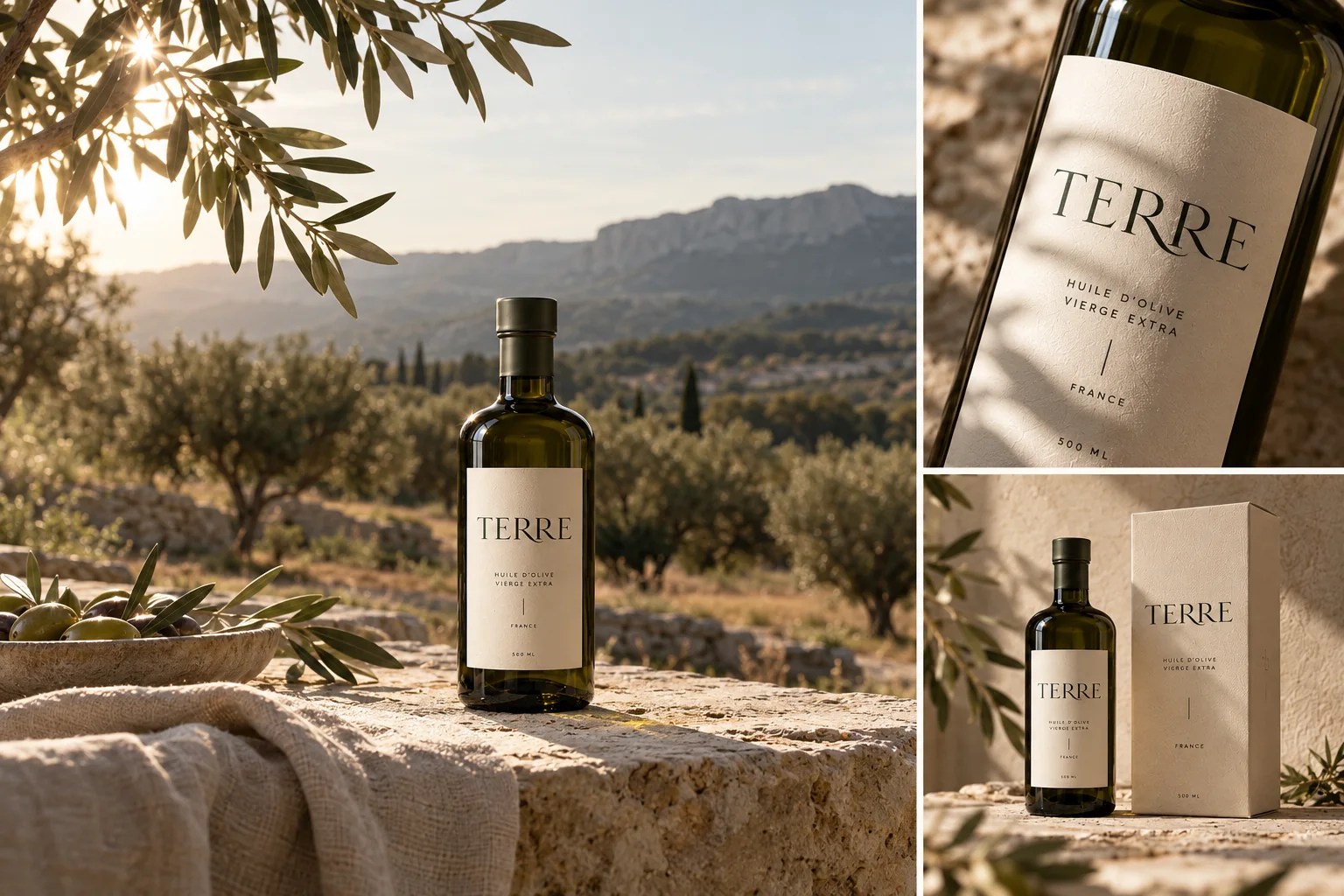
The origin: Everything begins with the land.
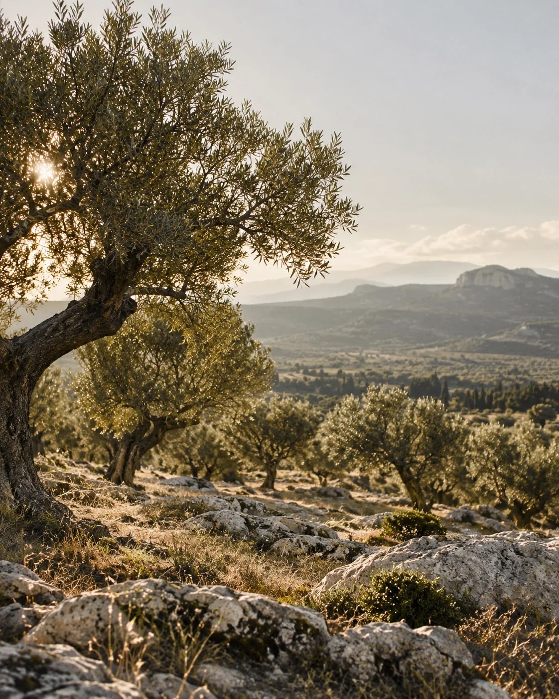
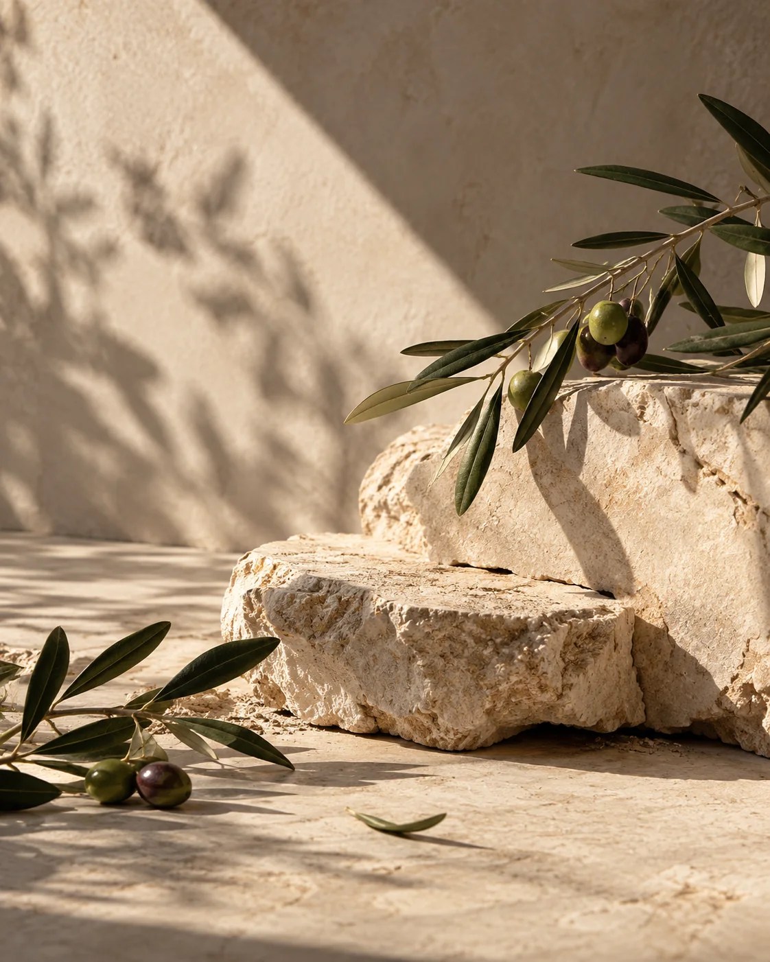
Before the product, there is a place. The rugged limestone, ancient olive trees, and warm Mediterranean light of southern France became the starting point for TERRE’s visual world.
These natural elements informed every creative decision, from the earthy color palette to the tactile packaging materials and documentary-inspired photography. The objective was not to romanticize tradition, but to reinterpret it with a contemporary point of view.
Visual identity: A quiet kind of confidence.
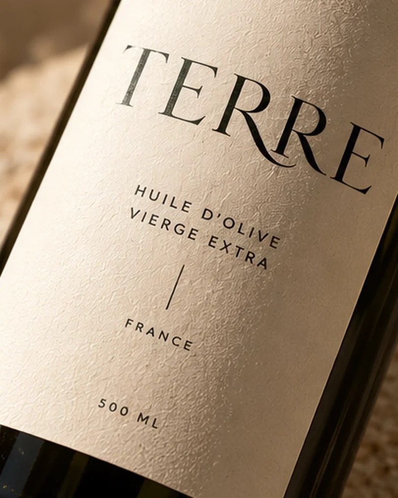
The TERRE identity is built on simplicity, balance, and permanence. A refined serif wordmark brings an editorial character to the brand, while its subtle typographic details create a distinctive signature.
Deep olive green, warm ivory, limestone, and muted earth tones form a palette directly inspired by the natural environment. Together, typography, color, and generous negative space create a visual language that feels timeless without being nostalgic.
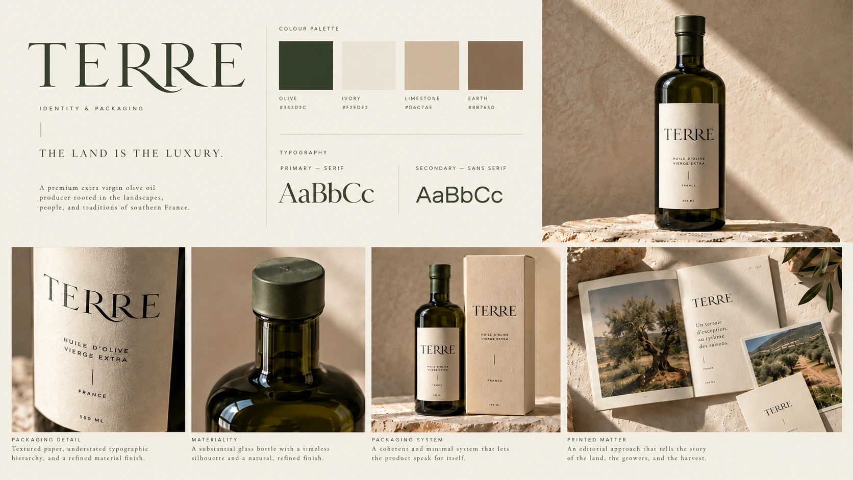
Packaging Design: Nothing unnecessary.
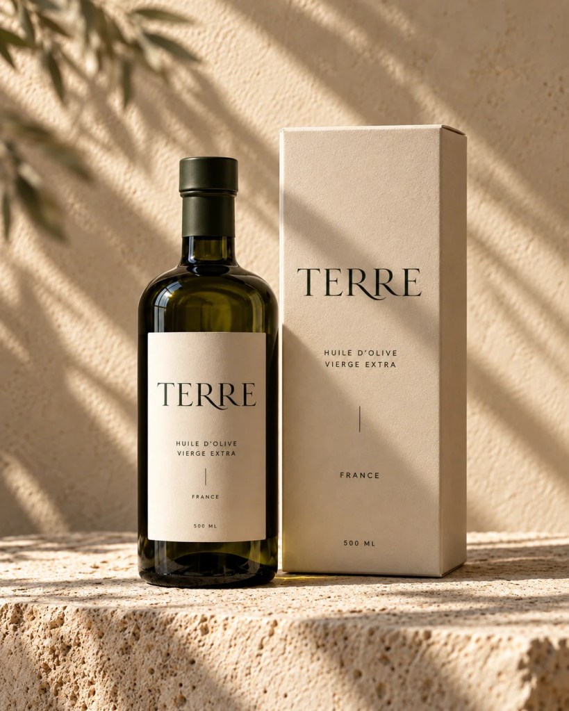
The packaging translates TERRE’s philosophy into a physical object.
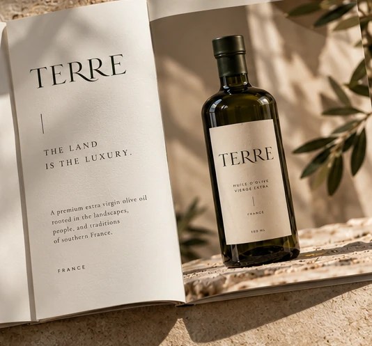
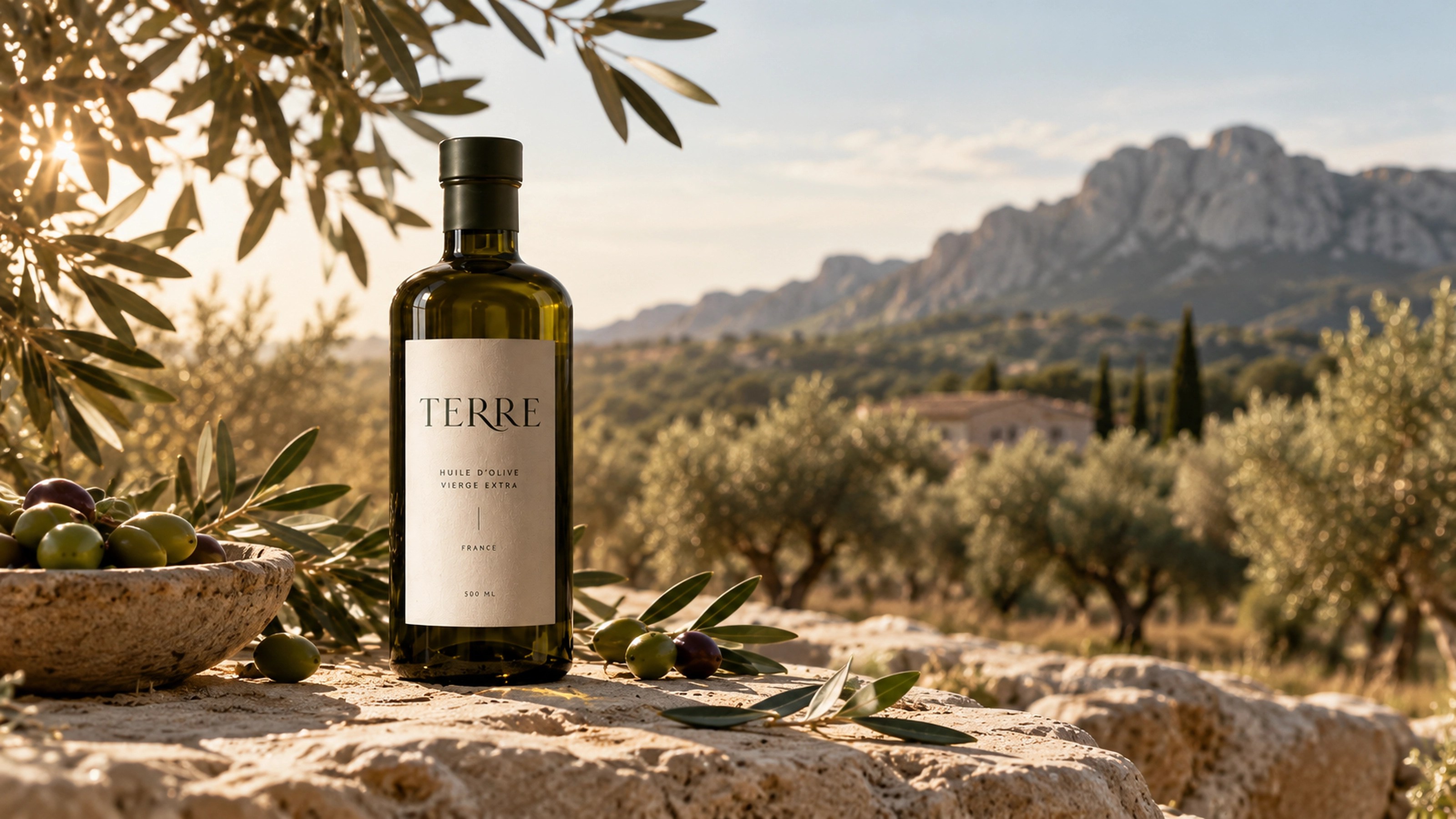
A deep olive-green glass bottle, textured ivory label, and restrained typographic composition create an understated yet recognizable presence.
The design avoids decorative conventions associated with traditional olive oil packaging, allowing material, proportion, and typography to communicate quality. Every element has a purpose. Nothing is added simply to attract attention.
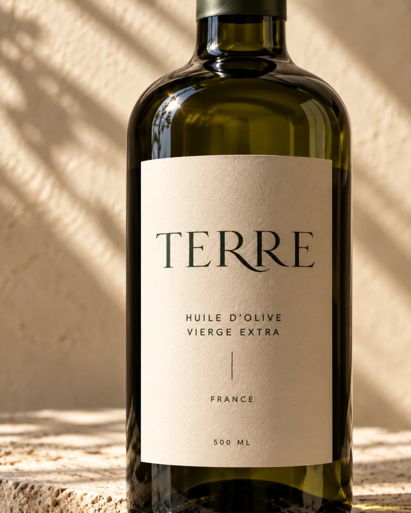
Campaign Photography: A sense of place.
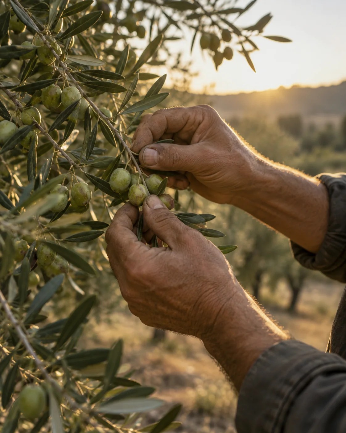
The photographic direction extends TERRE beyond the bottle and into the landscape that defines it. Natural sunlight, limestone surfaces, soft shadows, and Mediterranean vegetation create a warm and tactile visual atmosphere.
The product is photographed with the same restraint as the identity: honest materials, carefully considered compositions, and a strong sense of place.
Rather than staging luxury, the imagery finds beauty in the ordinary rituals and textures of the Mediterranean.
The land becomes the visual language.
Editorial & Print: Stories worth preserving.
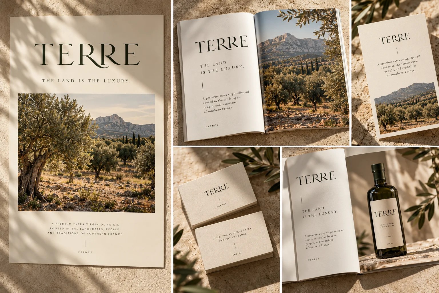
The editorial applications create space for the brand’s origins to unfold.
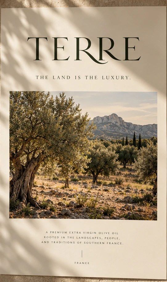
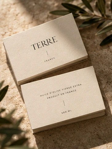
An origin booklet, printed cards, and photographic layouts combine generous white space, expressive typography, and documentary-inspired imagery.
Natural paper textures and a restrained visual hierarchy give these applications a considered, collectible quality. The result is a printed experience that feels connected to the product: thoughtful, tactile, and quietly distinctive.
Digital Experience: Tradition meets contemporary design.
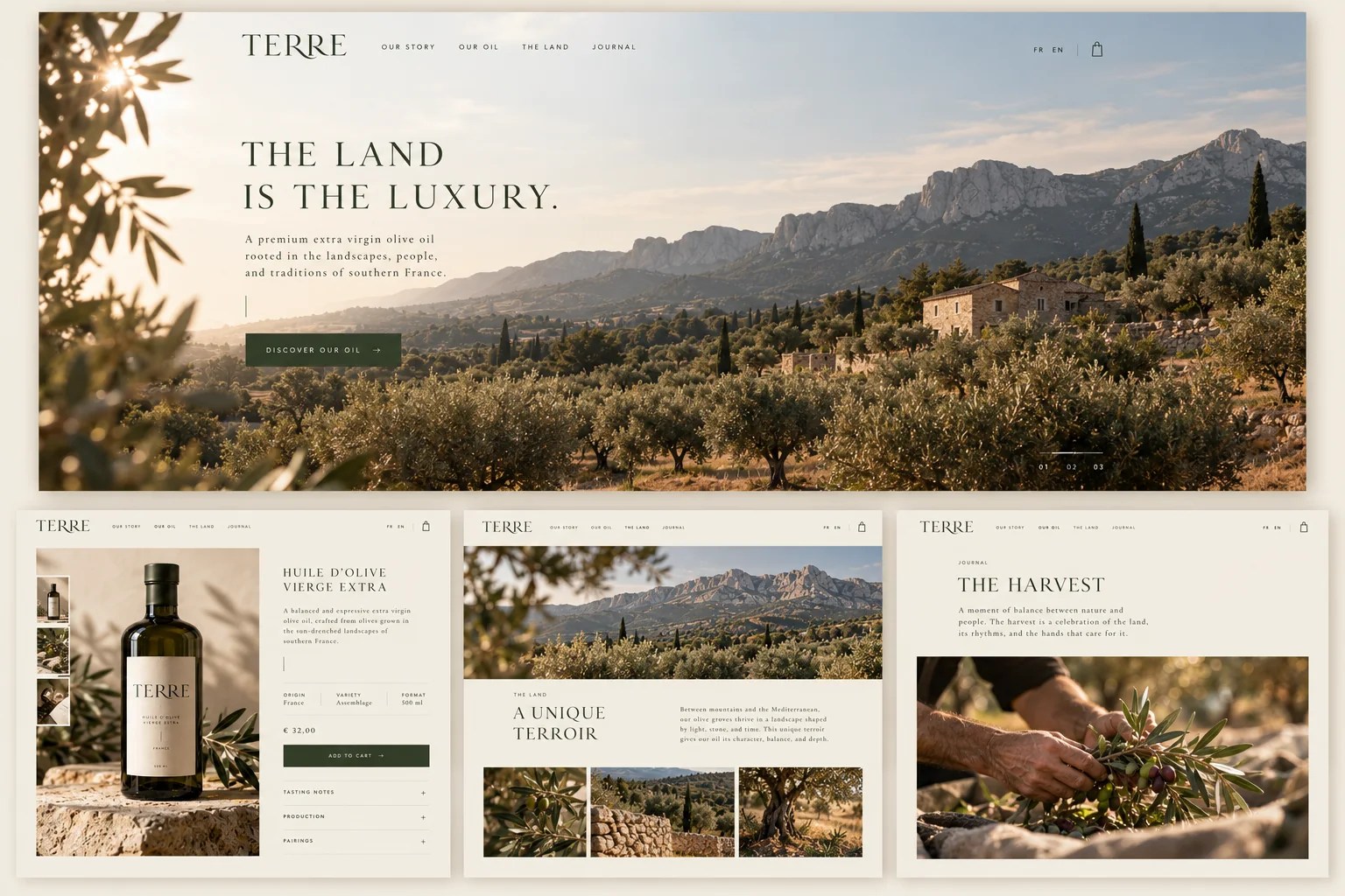
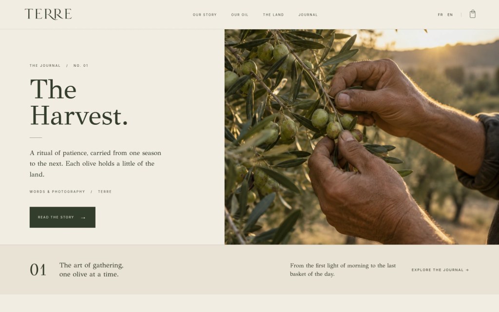
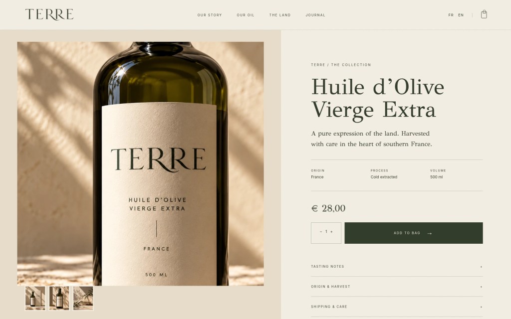
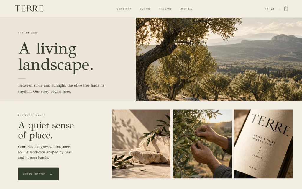
TERRE’s digital experience brings the identity into a clear, immersive editorial environment. Large landscape photography, refined typography, and a spacious layout create a natural rhythm between storytelling and product discovery.
The website balances the emotional world of the brand with a simple, intuitive shopping experience. Each interaction is designed to feel considered, allowing the product and its origins to remain at the center.
A digital expression of the same philosophy.
The Result
Rooted in nature. Made for today. TERRE explores how a traditional product can be reimagined through a cohesive contemporary identity.
From the wordmark to the packaging, campaign imagery, printed applications, and digital experience, every touchpoint follows one guiding principle: The land is the luxury.
The result is a brand world designed to feel tangible, enduring, and unmistakably connected to its origins.
Crédits : Tom A.
